11 Features that Make Mockplus iDoc Standing Out

With Mockplus iDoc, designers can handoff designs with accurate specs, assets, code snippets, and interactive prototypes automatically.
Mockplus iDoc is the ultimate online design collaboration tool between designers and developers. It connects your entire product design workflow from design to development, and your entire team can focus on building better products, together. With Mockplus iDoc, designers can handoff designs with accurate specs, assets, code snippets, and interactive prototypes automatically.
It is no exaggeration to say that Mockplus iDoc is better than any other similar tools you’ve ever used. Let’s find out what makes it different!
1. Various Ways of accessing specs
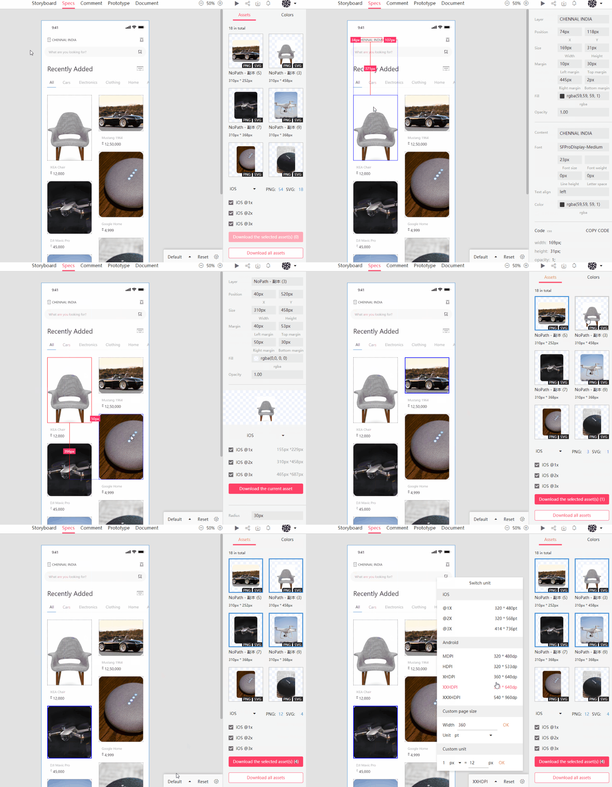
There are three specs modes available in iDoc. You can hover any layers; you can select a single or multiple layers; you can hold down Alt to convert specs to percentage values.
2. View tiny details of specs
Some design details might be too small. In iDoc, you can hold down Z key, and the Magnifier will pop up to help you view detailed specs.

3. View duplicate elements
Prototype Faster, Smarter and Easier with MockplusGet Started for FREE
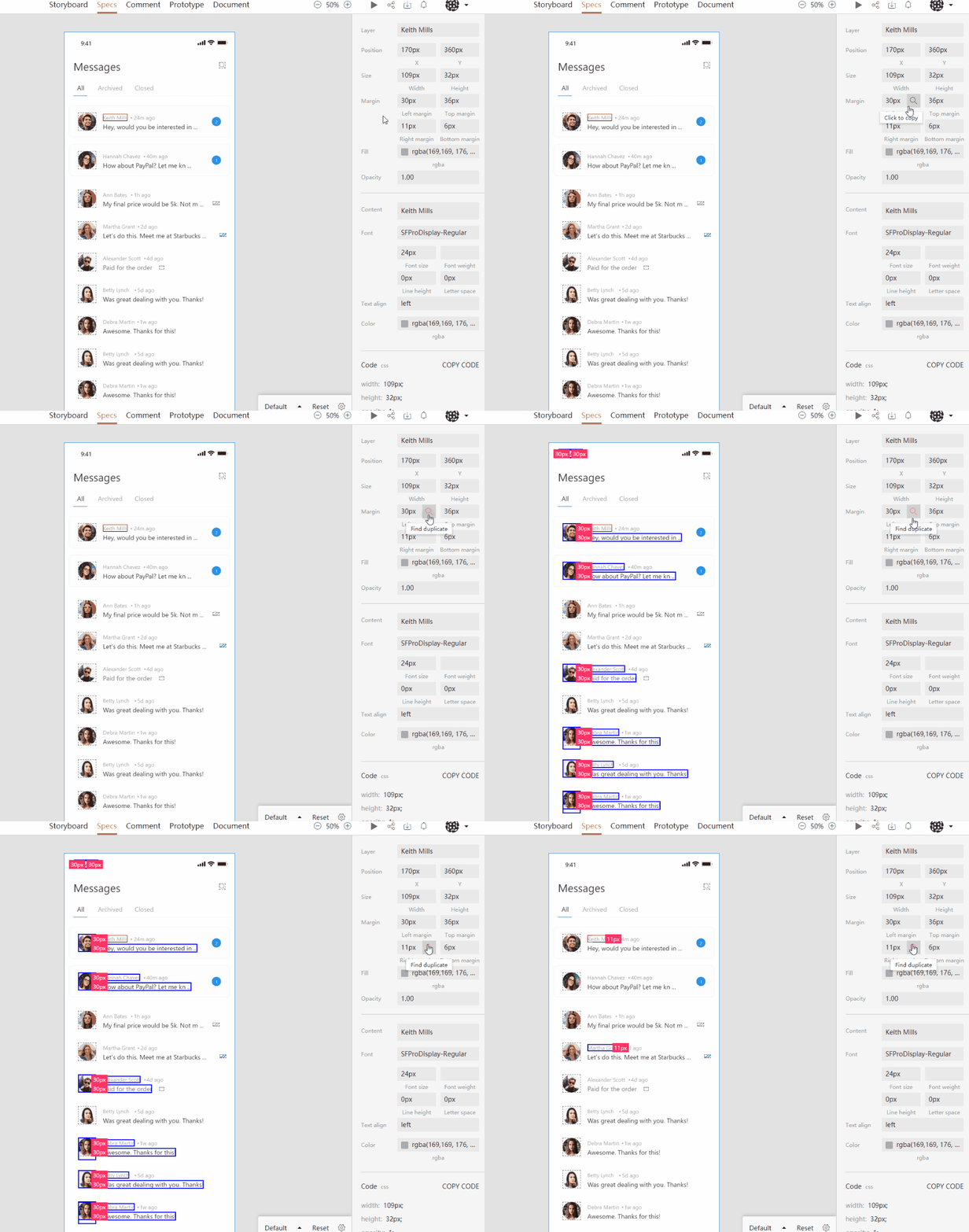
You need just one click to view duplicate design elements – elements like text, color, margin, and width. All duplicate items will be shown on the screen, and this will help you improve work efficiency.
4. Tailored resources, all in one place
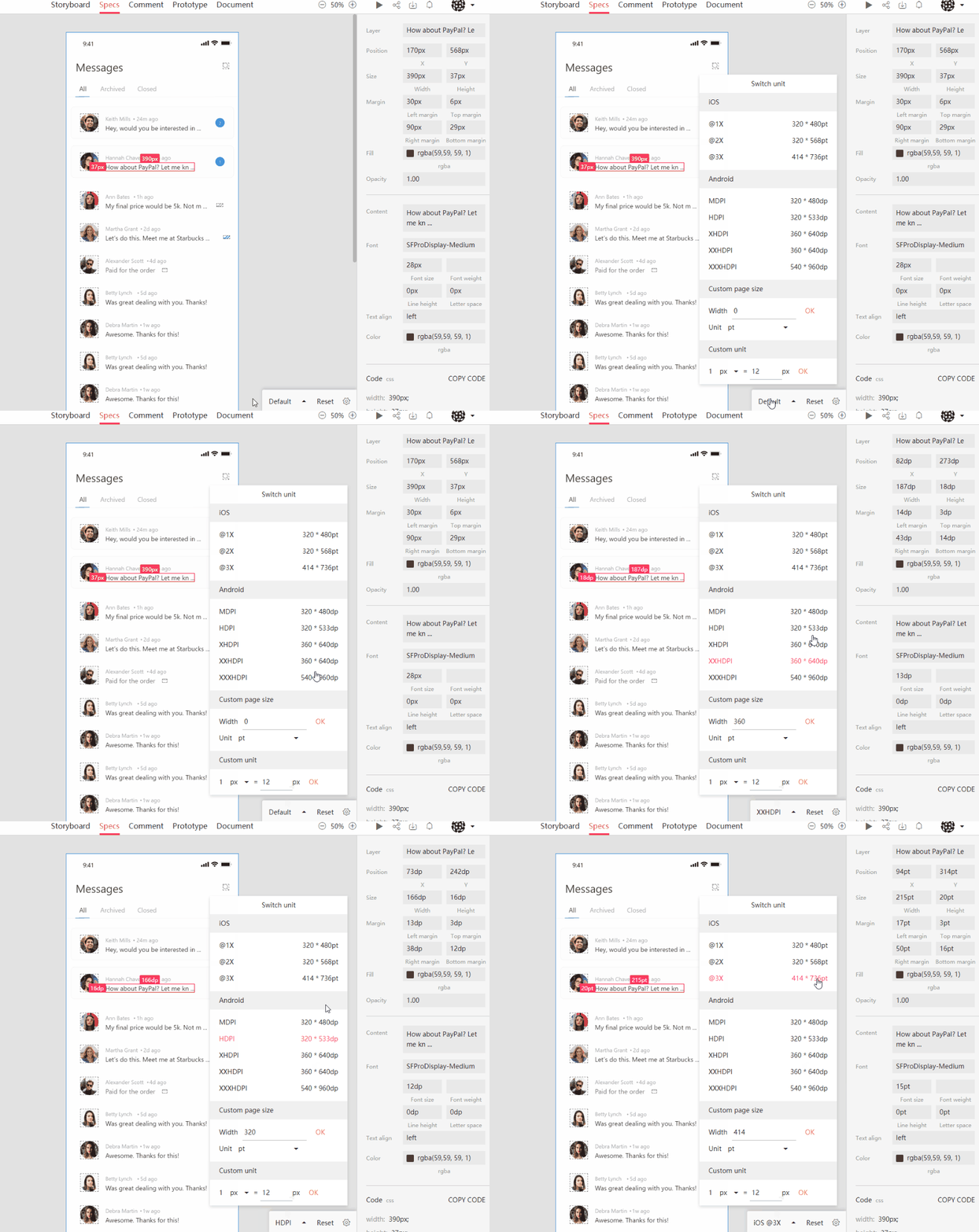
Mockplus automatically generates accurate specs, assets and code snippets from your designs—all of them are tailored for the platform you’re developing for. Moreover, iDoc automatically converts units based on your project type. No more getting lost in design files.
5. Build your team’s design styleguide
Collect and organize your team’s projects and resources automatically. Components, colors, text styles, – all of them will be in the easy-to-maintain style guide.

6. Show relations in full view storyboard
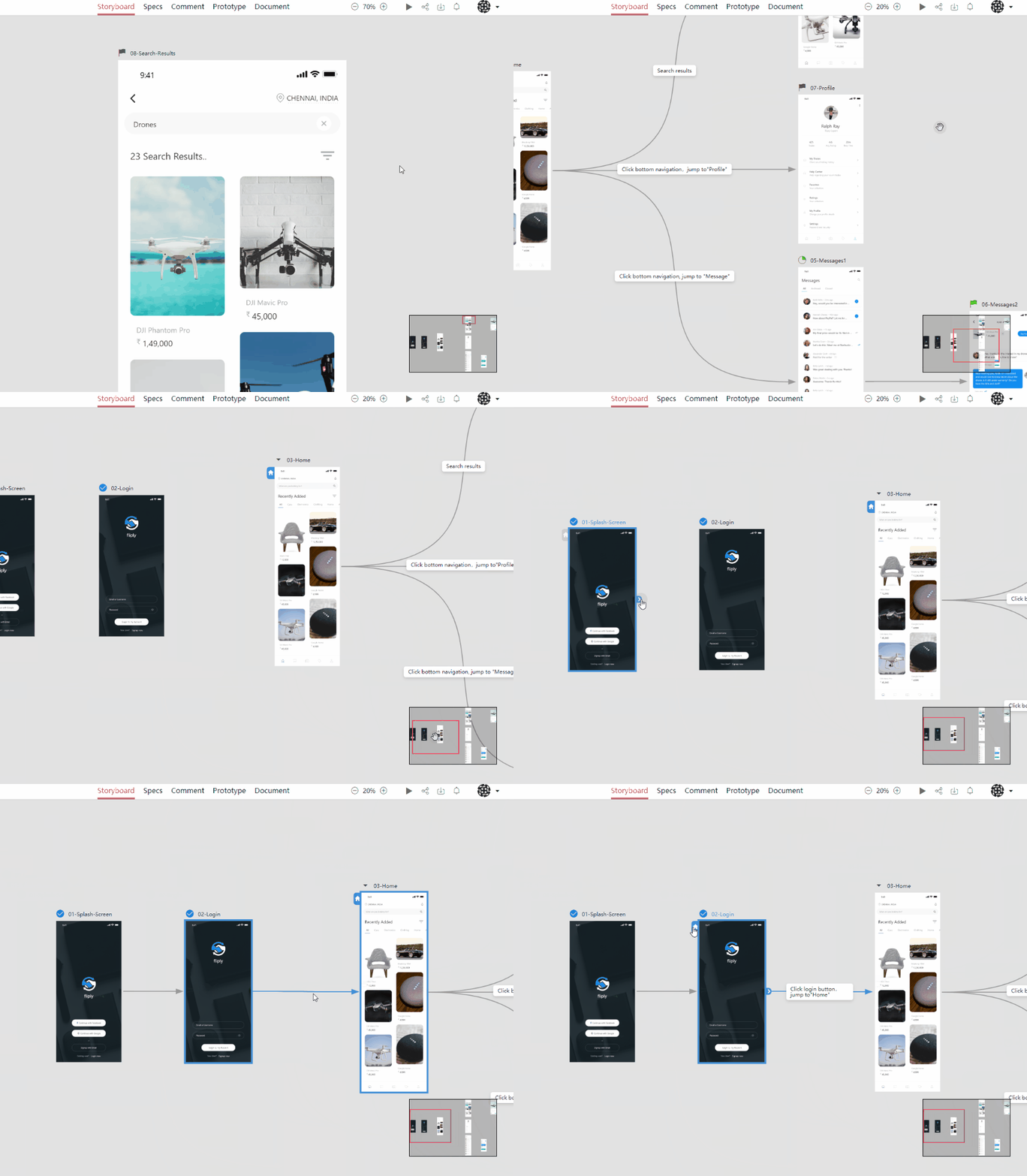
The full-view storyboard will contain all design screens from your product. You can zoom in /out to see it in details. You can create a relationship between screens by dragging & dropping a Line between them. You can provide more details by adding Line description. The navigation map will help with fast positioning.
7. Comments with various styles
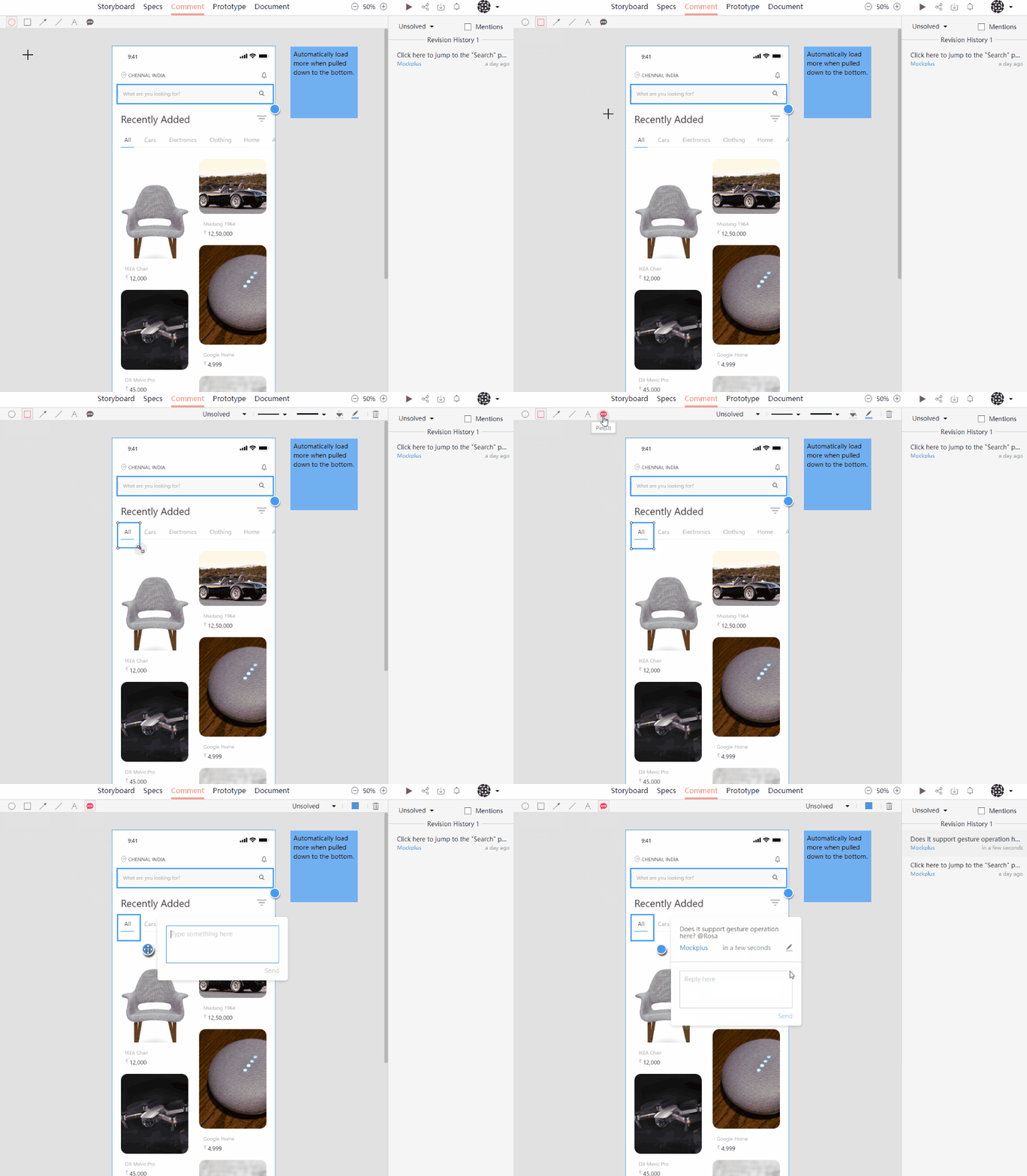
IDoc provides various comment styles for your comments, including Pin, Circle, Rectangle, Arrow, Straight Line, Text. Comments are available in real time so you can gather instant feedback and this will help you move projects forward.
8. Hi-fi interactive prototype
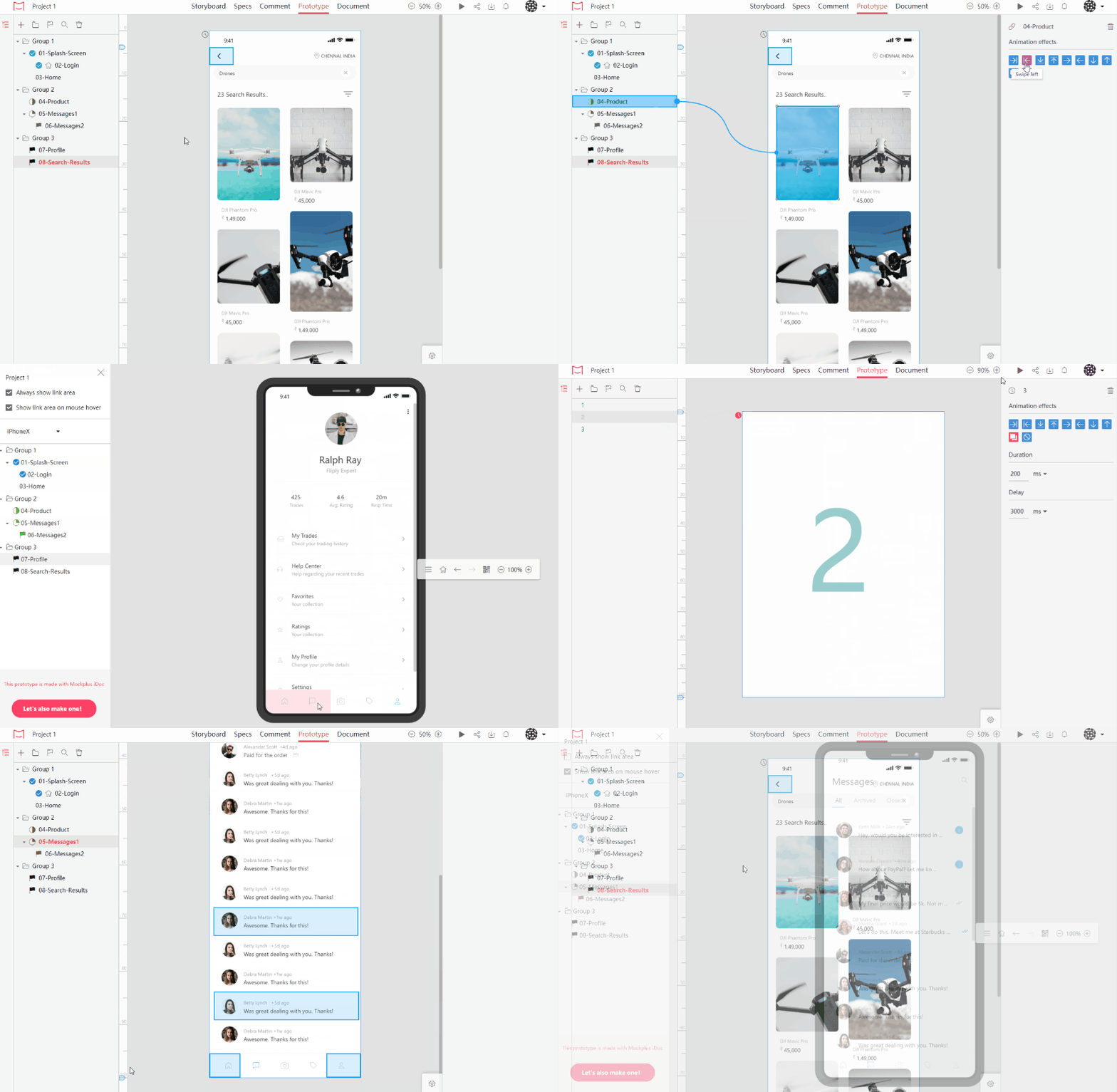
Effortlessly transform your static design files into working prototypes with just a single click. IDoc provides nine transition animations and support auto jumping and setting a fixed area.
9. Group and manage design screens
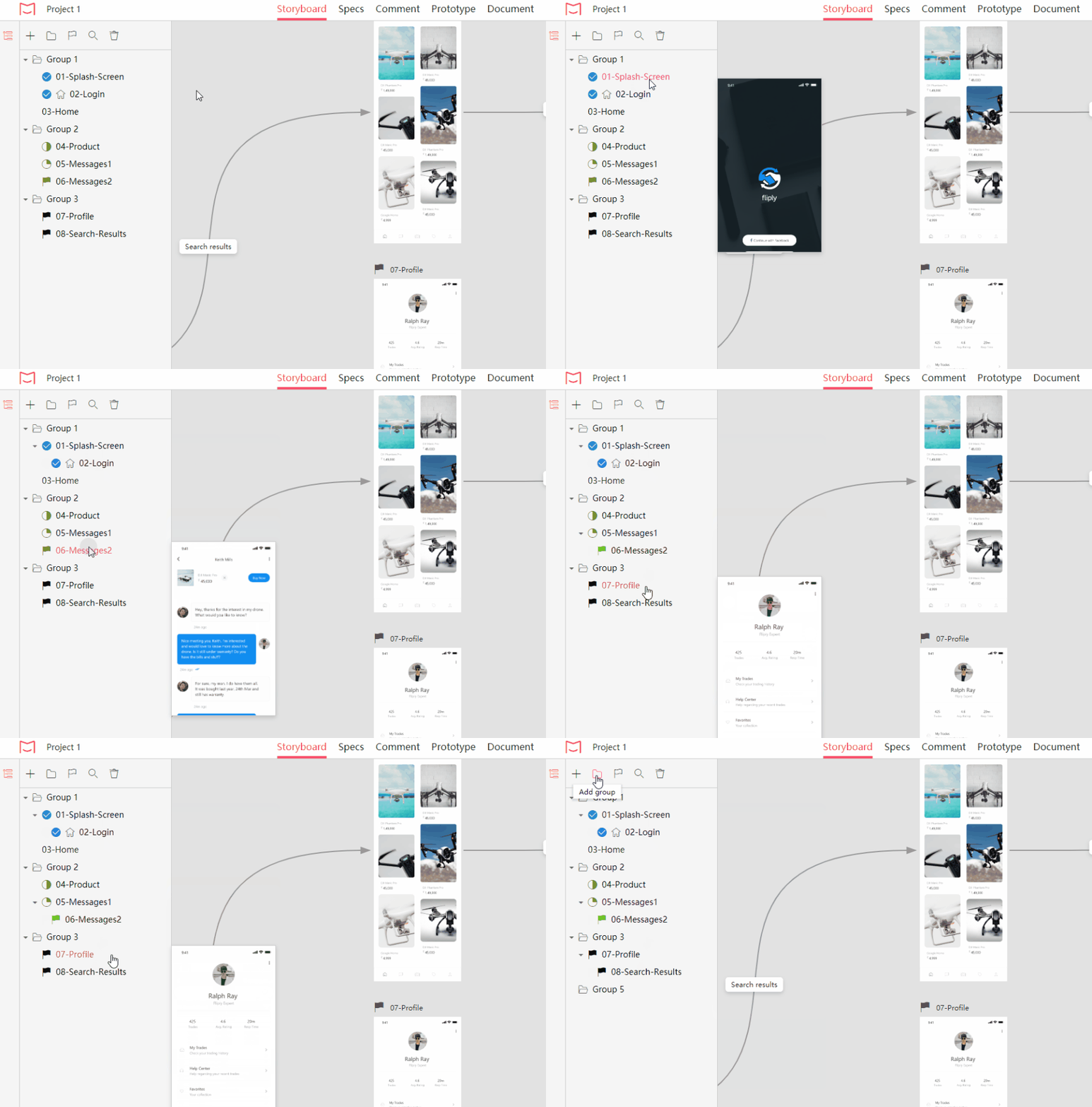
In IDoc, screens are managed in the Screen Tree and can be grouped easily. The structure is clear at a glance.
10. Control your project progress easily
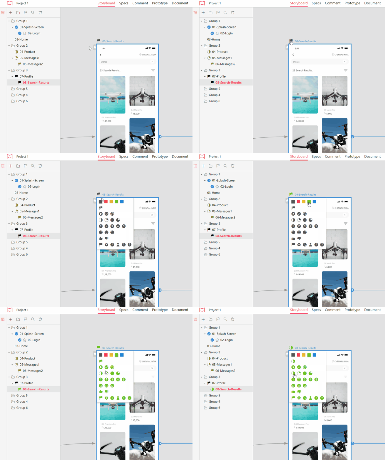
You can combine icons (20 icons provided) with colors to mark progress, show priority or provide a comment on designs. It is also possible to sort design screens visually.
11. Keep everyone on the same page
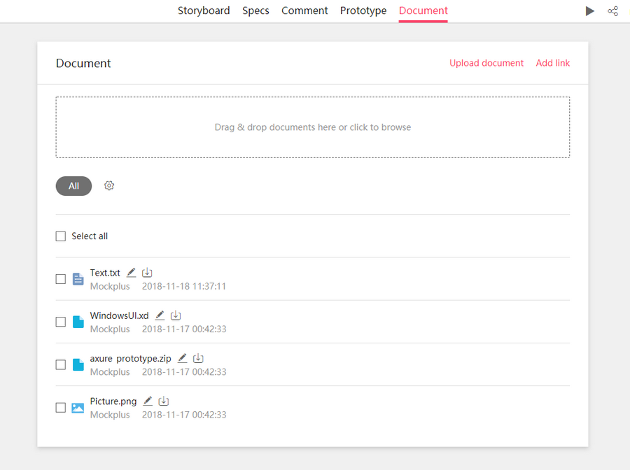
IDoc provides a flexible space to share all documents with team members throughout the entire design process. You upload product documents (such as Axure/Justinmind/Mockplus), and your team members can download or preview them online. All documents can be grouped.
Let’s start your travel in efficient product design collaboration with Mockplus iDoc right now!