How to Achieve Good Enterprise UX in Enterprise Products

A good enterprise UX is increasingly important. We bring you some excellent examples on how to achieve good enterprise ux in enterprise products.
Nowadays, enterprise products are increasing in market share and a good enterprise UX is increasingly important.
The average person’s expectations for enterprise products tends to focus on those functions that improve work efficiency and protect information.
Traditionally, the user experience of these products was not a factor in their design. That is no longer the case, with an increased focus on finding ways to improve the user experience in using enterprise products. We bring you some excellent examples on how to achieve good enterprise ux in enterprise products.
Web App design highlights
Color matching
Color is one of the main design elements in eliciting emotion. A clear brand color can greatly increase trust and awareness. In addition to improving the aesthetics of the interface, color can also serve as a functional aid. In enterprise products with a large amount of information on a common page, it is often easiest to attract a user’s visual focus with a colored button.
Lovely is a web app designed by Derbbble’s great Kerem Suer. The color theme is orange (main), blue (auxiliary), and light gray (background). This color scheme is both bright and light. The overall feeling is simple, harmonious, and comfortable.

Squarespace uses a black and white color theme, and is arguably the best example of this color combination. The broad use of white space, high-quality pictures, and excellent interaction, you find a surprise every time you open a sub-page.

This is one of my favorite web pages. Even Icon has adopted the brand style of Squarespace.
It is often found that many designers are limited by the size of the screen when designing a web or mobile app, while facing the daunting task of displaying all information on one screen.
This issue can easily be resolved through the use of slide and scroll. You can slide a new interface to the current screen through animation, or you can scroll through the top, bottom, left and right of a screen to view more content.
One thing to remember is the size of the notebook is still a factor to consider and a broad use of white space is not effective.
A great example of this type of space processing comes , from Dribbble.
Prototype Faster, Smarter and Easier with MockplusGet Started for FREE

This idea is best reflected in a mobile app with limited screen size.

3. Reduce the line
In a flat design, try to use contrast between color blocks instead of lines. Reducing lines can make your interface look more concise. Looking back, try and remove lines as much as possible in your design draft. Your design will take on a fresh new appearance.

4. Consider different sizes
With increasing screen sizes, websites that were previously set at 1000px width no longer function adequately. Therefore, in designing web apps, you need to consider how the interface elements are displayed in different screen sizes. The most basic requirement is to consider the largest and smallest scenes: 1920×1080, 1024×768.

Mailchimp is a great example of responsive design. For a more in-depth look at responsive web design, read the responsive web design article from ISUX Long Ge .

Inspiration for enterprise product design
Simple
Although the logic behind your product is complex, it is important that it appears simple and efficient when presented to the user.
Trello is a multi-person task collaboration class web app. Its task board can easily move tasks from one stage to another with just a mouse click.

Mailchimp is a web app for email production and tracking. A visual template is provided for creating mail templates. Basically a user needs to only Drag & Drop and enter the required values to complete the design.

Mockplus iDoc is a web app designed to help designers better collaborate with their teammates. Its management page is very convenient for grouping, you can add a dividing line anywhere, and then Drag&Drop to move the group in which the picture is located. The interactive modeling process is faster and more efficient, and can be sent to other non-iDoc users for viewing with one click.

Progressive presentation
Many web apps have a common problem, which is presenting a lot of functions all at once. As a result, when the user is exposed to the app for the first time, they face an interface with a huge amount of information.
Many times, users become overwhelmed and lose interest due to information overload or setbacks setbacks in the experience. To enhance the product’s first impression to the user, try using progressive presentation to show the interface.
Take Trello as an example. When you log in for the first time, only one item box is presented on the interface. The user will naturally pay attention to and click on the only eye-catching element available. After entering the project, a task version will be displayed. Click one of the tasks to display the task details.

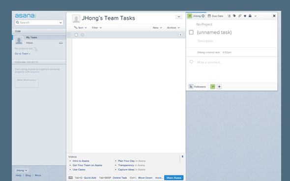
Also for the first time, Trello compares Asana’s expression to make it a lot easier.

This layered and progressive design approach keeps the interface simple, enhances the first impression of the user, and reduces the psychological burden of the user. Similar thinking, in fact, is often used in web design.
For example, Apple’s official website will only display the entrance of different products at the start. After entering a specific product, you can click to see more. For more instructions on progressive presentation, you can read this designer recommended by ISUX to understand the psychology behind it.
Mobile phone experience
The right amount of animation can contribute to a product’s emotional appeal. Nowadays, HTML5 and CSS are developing rapidly and can create a unified mobile experience.
Squarespace drawer navigation.

Teambition is a domestic project collaboration web app, and its inbox is like the notification center of iOS7. The overall design is also very simple and easy to use.

Conclusion
The purpose of enterprise products is to serve the enterprise and serve the people.
I have always believed that the minimalist concept of Apple and Google serve as good examples for designers. It is challenging to design complex enterprise products that are simple and fun. In the face of simplicity, there needs to be strong technical support behind it, as well as the designer’s care and dedication to improve the details of human life.